


Origin Island alignment with status bar has been improved✨😍

Origin Island now aligns perfectly with the status bar — cleaner, smoother, better.
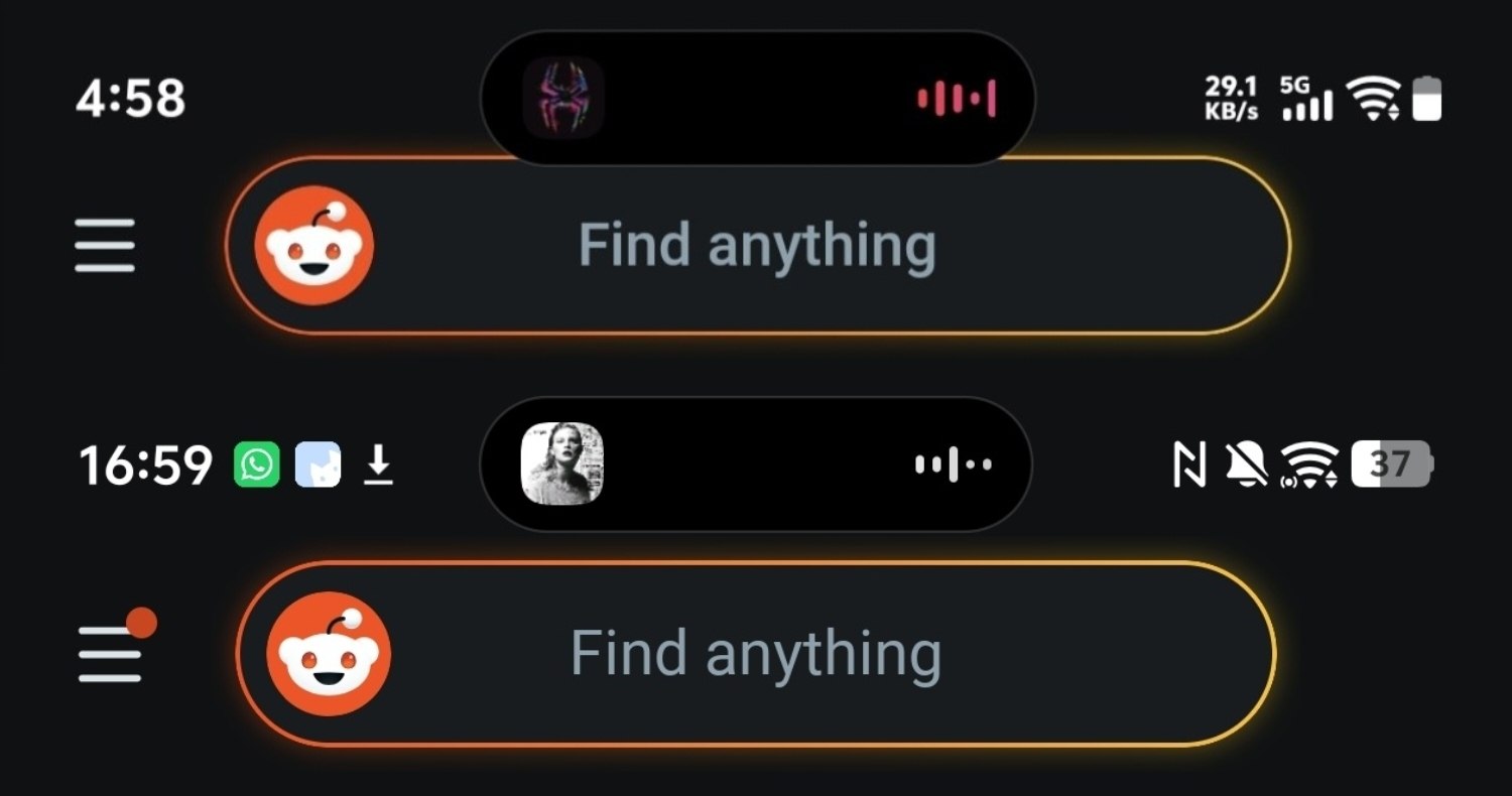
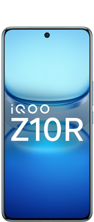
Figure 1, view larger image
The latest UI refinement brings a subtle yet impactful improvement to the overall experience — Origin Island alignment with the status bar is now more precise than ever.
In the before update, the spacing and positioning felt slightly off, creating a minor visual disconnect between the dynamic island and the system status elements. While functional, it lacked that polished, seamless feel.
With the new update, everything snaps into place:
🔸 Perfect Alignment – The Origin Island now sits naturally in sync with the status bar, creating a more balanced and visually satisfying layout.
🔸 Cleaner UI – Reduced visual clutter makes the interface feel more refined and modern.
🔸 Improved Consistency – Elements now follow a more structured alignment system, enhancing usability.
🔸 Smoother Experience – The update makes interactions feel more fluid and intentional.
This isn’t just a minor adjustment — it’s a design polish that elevates the entire interface experience.
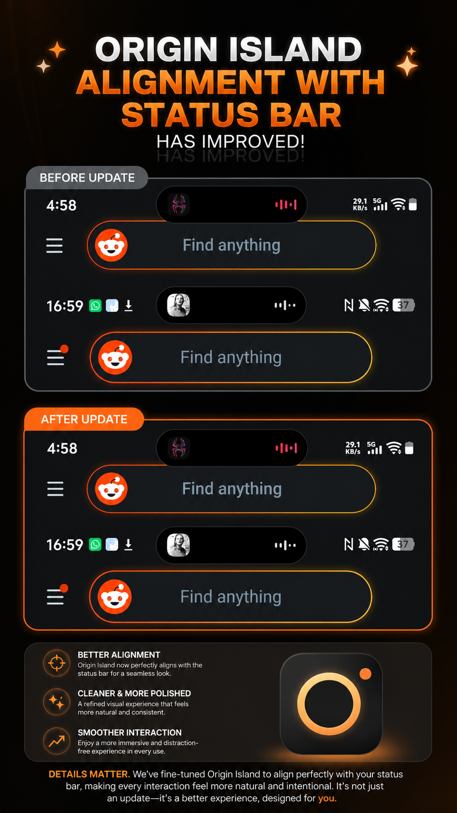
Figure 2, view larger image
Because sometimes, the smallest changes make the biggest difference. 🔥
Software Updates
569
7
Please sign in
Login and share
Sign in