


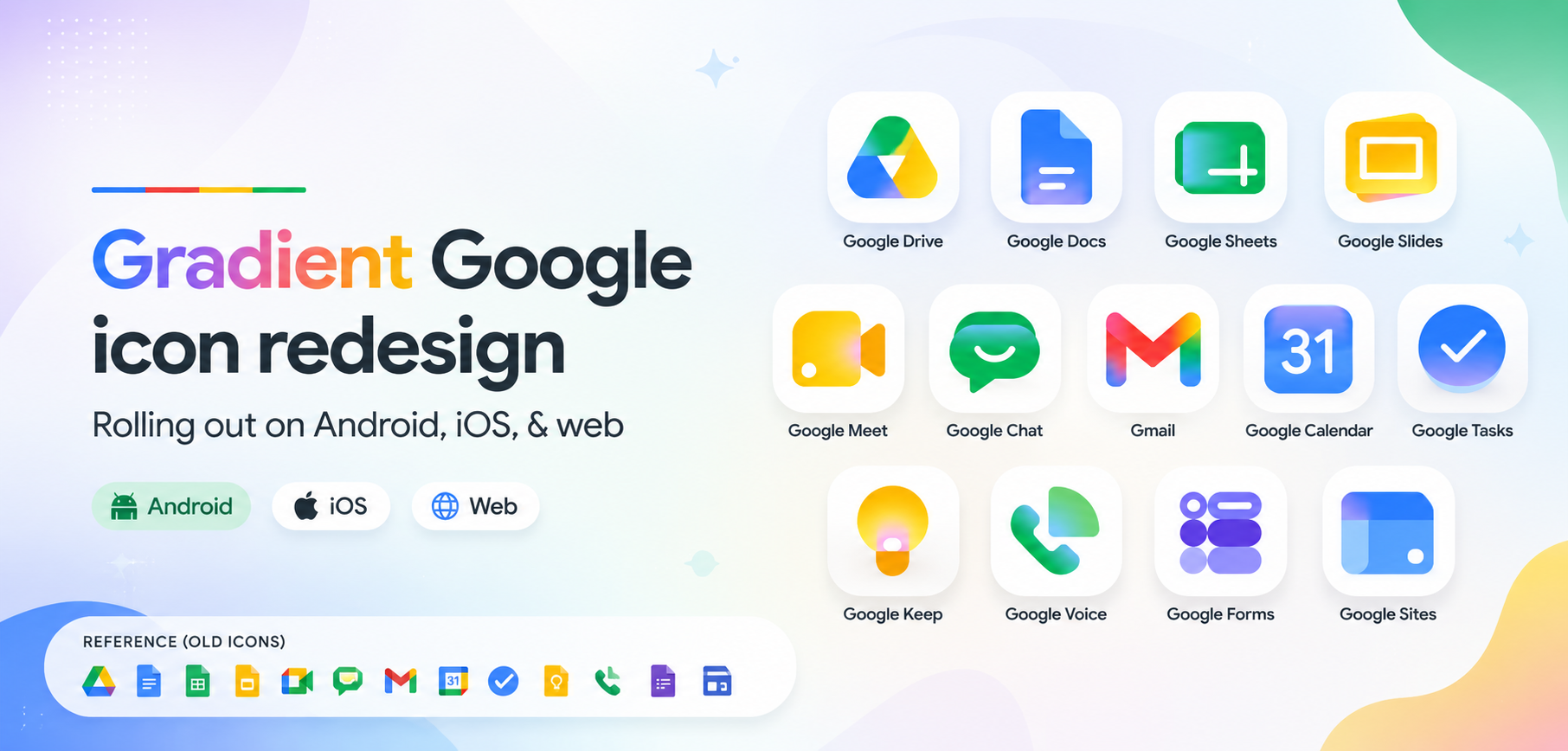
Gradient Google Icon Redesign Rolling Out on Android, iOS, & Web

Google is once again refreshing its visual identity and this time, the change is impossible to miss. The company has started rolling out a brand-new gradient-based icon redesign for several Workspace and productivity apps across Android, iOS, and the web.
From Gmail and Google Drive to Calendar, Meet, Docs, and Sheets, the familiar flat icons are now getting softer gradients, layered colors, rounded visuals, and a more modern “Material You” inspired look. The redesign signals Google's biggest visual refresh in years and hints at the company moving beyond traditional flat design language.
What's Changing?
The new icon set introduces:
- Gradient color transitions instead of hard color separations
- Softer, more layered visuals
- Rounded edges and cleaner shapes
- Improved visual consistency across Google services
- A modern aesthetic inspired by Material You and AI-era interfaces
Apps receiving updates include:
- Gmail
- Google Drive
- Google Docs
- Google Sheets
- Google Slides
- Google Calendar
- Google Meet
- Google Chat
- Google Tasks
- Google Keep
- Google Forms
- Google Voice
- Google Sites
According to reports, the redesign is gradually appearing in app launchers, Google's web interfaces, and Workspace ecosystems across platforms.
Why Google Is Moving Away From Flat Design
For nearly a decade, Google heavily relied on Material Design a clean, flat, colorful design system introduced in 2014.
But modern UI trends are evolving rapidly.
Today's interfaces are becoming:
- More expressive
- More fluid
- More depth-oriented
- More personalized
- More AI-centric
The new gradient icons appear to be Google's attempt to modernize its ecosystem while making apps feel visually richer without becoming overly complex.
Community Reactions Are Mixed
As expected, the internet is divided.
Some users love the redesign because:
- It feels modern and premium
- Icons now look more alive
- The gradients add depth and personality
- Apps feel visually refreshed
Others feel:
- The icons are harder to distinguish quickly
- Google apps are becoming visually too similar
- Flat design was easier for recognition
- The redesign resembles Microsoft or Apple aesthetics too much
A Reddit discussion around the redesign showed both excitement and criticism, with many users debating whether Google is improving clarity or sacrificing recognizability for aesthetics.
Google's gradient icon redesign is a bold visual shift that moves the company away from the rigid flat-design era toward something more fluid, layered, and expressive.
Whether users love it or hate it, one thing is clear:
Google is redesigning its ecosystem for the AI generation.
Show your support by following me @Andybitts and be the first one to access my new threads.
𝓗𝓪𝓹𝓹𝔂 𝓠𝓾𝓮𝓼𝓽𝓲𝓷𝓰.!
Aniket Patil
𝕮𝖔𝖒𝖒𝖚𝖓𝖎𝖙𝖞 𝕸𝖔𝖉𝖊𝖗𝖆𝖙𝖔𝖗
Please sign in
Login and share