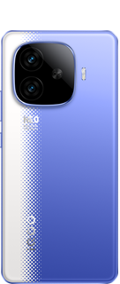
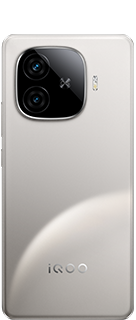
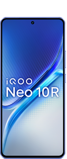
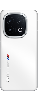
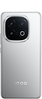
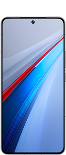
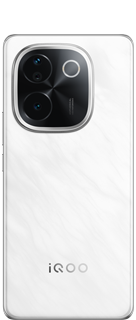
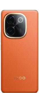
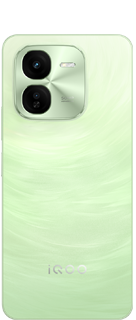
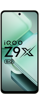
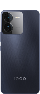
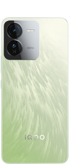
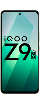
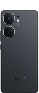
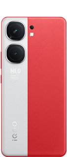
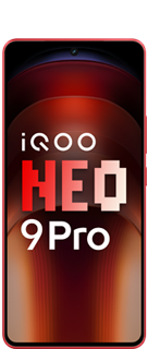
iQOO's 3rd Anniversary | Let's get iconic
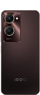
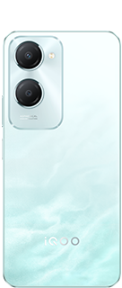
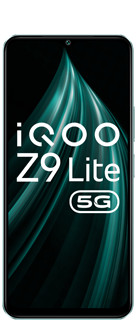
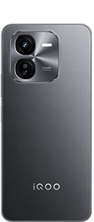
Here's my another entry for iQOO's third anniversary celebration. The idea behind this logo was the Q alphabet which always reminds me of these three qualities which I have found in my iQOO device. They(the qualities) are
1. Quality- I have used a few iQOO products and have found that all of them are really great matter of product quality.
2. Quick- All of the iQOO smartphones are quick and fast, even the firm has a collaboration with one of the fastest car manufacturers in the world(BMW)
3. Qualified- iQOO smartphones have been tested a lot before they are launched in the market. And they have some great certifications in the similar field from TUV Rheinland, and the devices are also observed for at least 1000 charging cycles in the case of fast charging devices. So the devices are tested, certified and they qualify all the needs of the market.
So this was the background of my motivation to design this logo.
Here are some variations of the logo. Please let me know which one do you like the most.


Please sign in
Login and share
